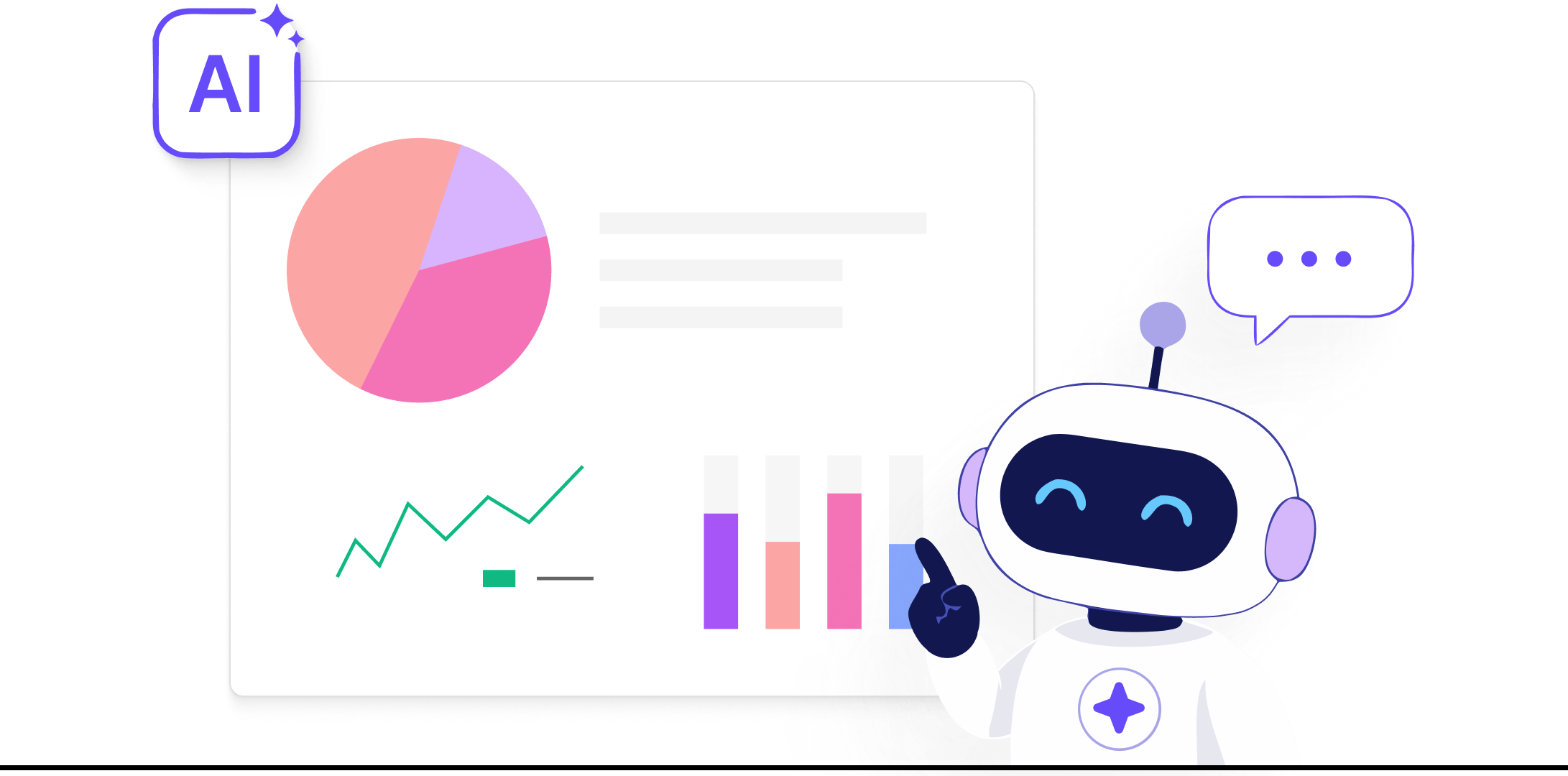
Turn Numbers into Decisions with Interactive Dashboards
SutiDAnalytics gives you a comprehensive set of chart types, a drag-and-drop dashboard builder, full chart customization, and specialized views for financial and KPI data. Everything you need to build dashboards your entire organization can act on.
SutiDAnalytics supports a comprehensive set of chart types covering every common analytical need. The platform intelligently recommends the most appropriate chart type based on the data types in your selected columns, removing guesswork for analysts and making the tool accessible to non-technical users.
Charts for Every Use Case
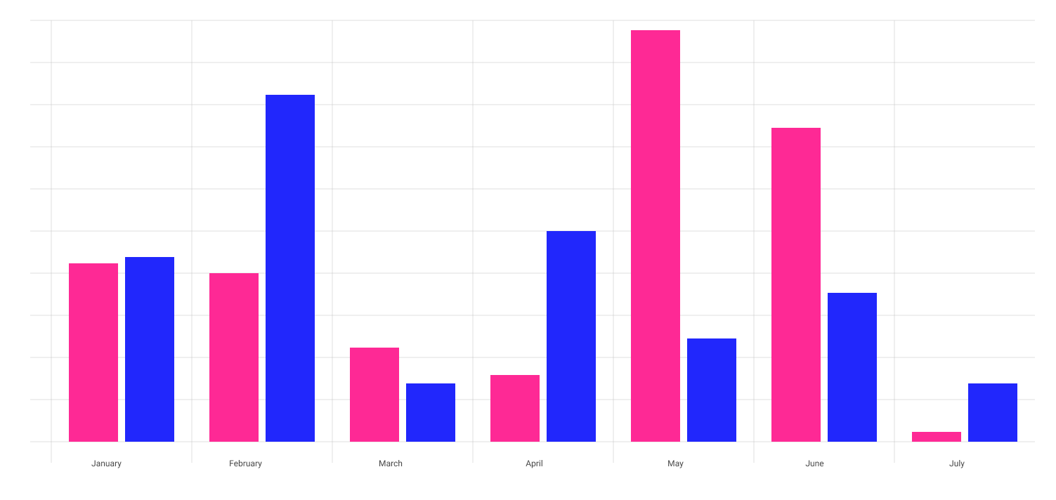
Bar Chart
Compare values across categories. Ideal for ranking products, regions, departments, or time periods side by side.
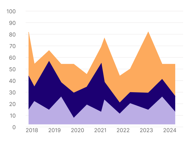
Area Chart
Visualize cumulative trends and volume over time. Useful for showing total versus individual contribution.
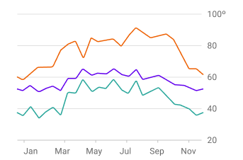
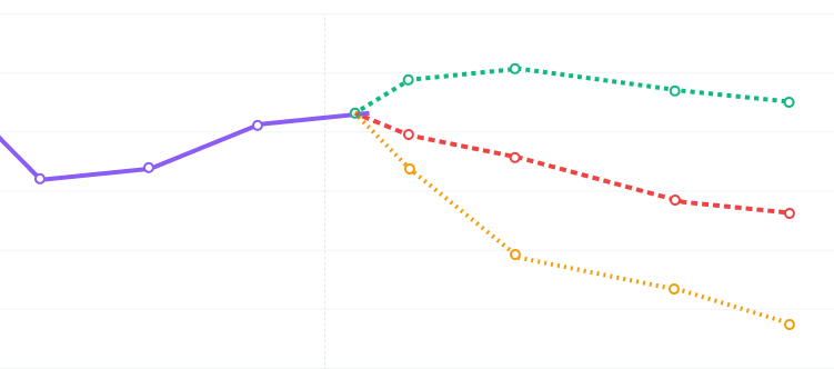
Line Chart
Track trends and changes over time. Best for revenue trends, user growth, and any metric measured at regular intervals.
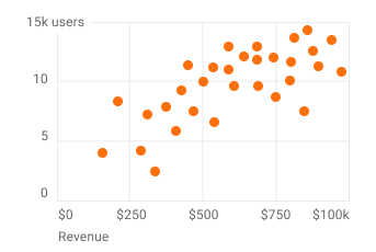
Scatter Chart
Identify correlations between two variables. Ideal for spotting relationships between spend and revenue, or effort and output.
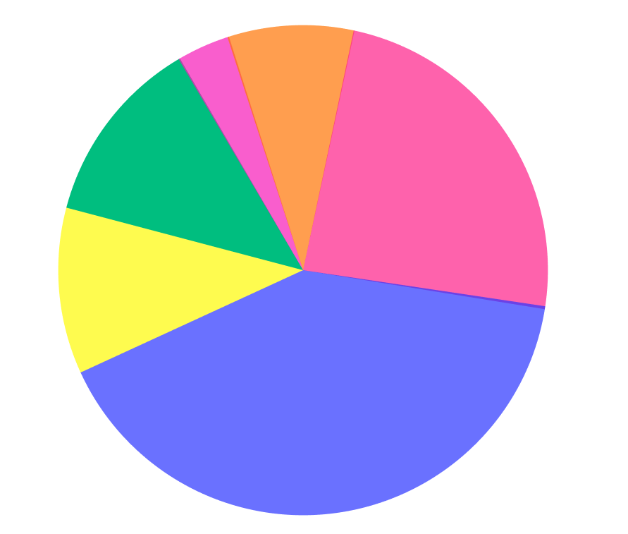
Pie Chart
Show proportion and part-to-whole relationships. Best for market share, budget allocation, and category breakdowns.
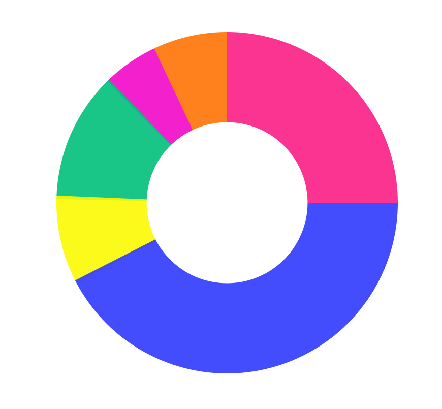
Donut Chart
Pie chart variant with center space for displaying a key total metric alongside the proportional breakdown.
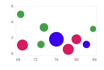
Bubble Chart
Compare three variables simultaneously using position and bubble size. Ideal for product portfolio and risk analysis.
Treemap
Visualize hierarchical data by proportional size. Best for product category performance and budget breakdown.
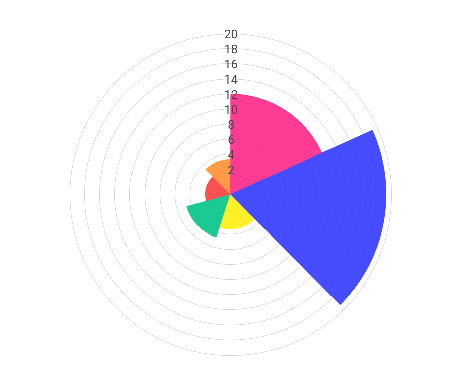
Sunburst Chart
Multi-level hierarchical proportion view. Ideal for showing how a top-level category breaks down through multiple sub-levels.
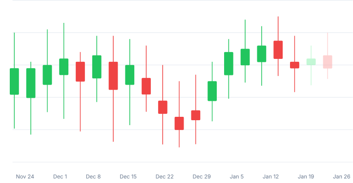
Candlestick Chart
Financial OHLC time-series analysis. Shows open, high, low, and close values per period for financial and volatility data.
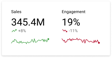
KPI Card
Bold single-metric display with period-over-period comparison badges. Designed for executive scorecards and headline metrics.
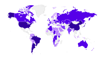
Geo Chart
Geographic and location-based data visualization with advanced geospatial and spatial pattern analysis capabilities.
Key Capabilities:
Major chart types covering all common use cases
AI-powered chart type recommendation
Geographic and geospatial mapping
Financial candlestick rendering
KPI card with period comparison
Best For: Any team presenting data visually, from executive KPI dashboards to analyst deep-dives to geographic sales maps.
DYNAMIC VISUALIZATIONS
Build Multi-Chart Dashboards With Drag-and-Drop Simplicity
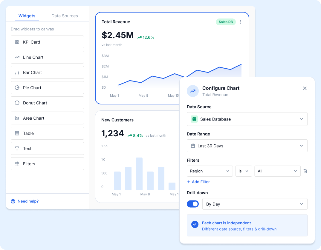
SutiDAnalytics lets you build fully interactive dashboards without any configuration files or developer involvement. Drag any column onto an axis, select a chart type, and your visualization appears instantly. Add multiple charts to a single canvas and arrange them using a responsive grid layout. Resize and reposition each chart independently.
Each chart on the dashboard can draw from a different data source, use its own filters, and have its own drill-down configuration. A single dashboard can show sales data from your CRM alongside operational data from your ERP and marketing data from your cloud storage, all in one centralized view.
Key Capabilities:
Drag-and-drop dashboard builder
Multi-chart canvas with grid layout
Resize and reposition charts independently
Each chart supports a different data source
Per-chart filter and drill-down configuration
Responsive layout for different screen sizes
Best For: BI teams building centralized dashboards, product managers combining multiple data sources, operations teams monitoring cross-department KPIs.
CHART SETTINGS
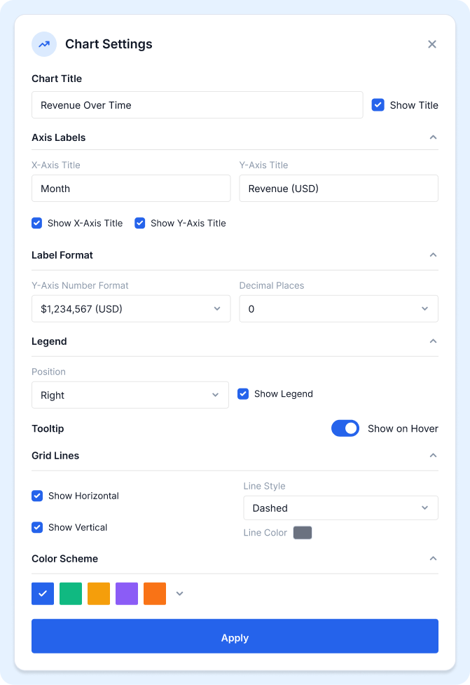
Every Chart, Customized to Your Exact Specification
Every chart in SutiDAnalytics can be customized independently, so each visualization in your dashboard looks and communicates exactly as intended. Settings are applied per-chart, meaning two charts side by side can have entirely different appearances while remaining part of the same cohesive dashboard.
Customization Options
Chart title and subtitle
X and Y axis labels
Legend position — top, bottom, left, right, or hidden
Color scheme selection
Data label format — number, percentage, currency, or custom
Grid line visibility
Tooltip content and format
Key Capabilities:
Full per-chart customization
Axis label and title control
Color scheme and label format options
Legend positioning
Tooltip and grid line settings
Best For: Teams building client-facing dashboards, analysts creating presentation-ready reports, organizations with brand guidelines for data visualization.
KPI METRICS VIEW
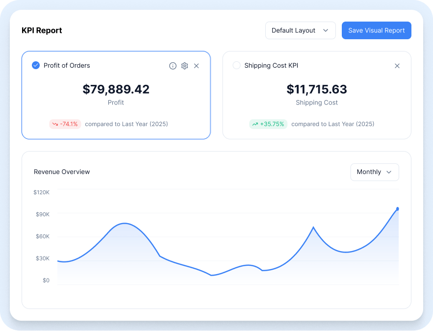
Executive Scorecards That Tell the Full Story at a Glance
KPI Metrics View displays your most important business numbers as bold, large-format metric cards, designed to be read and understood in seconds. Choose from Sum, Min, Max, Mean, and Median aggregations and arrange multiple KPI cards side by side for easy scanning across your most critical metrics.
Enable period-over-period comparison to add color-coded percentage change badges to each card (green for improvement, red for decline) across weekly, monthly, quarterly, or annual comparison periods. At a glance, any stakeholder can see not just the current number but whether performance is trending in the right direction.
Key Capabilities:
Bold large-format metric card display
Sum, Min, Max, Mean, and Median aggregations
Multiple KPI cards side by side
Period-over-period comparison
Color-coded percentage change badges
Weekly, monthly, quarterly, and annual comparison periods
Best For: Executive dashboards, weekly business reviews, CFO reporting, sales performance tracking, operational KPI monitoring.
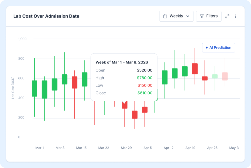
CANDLESTICK CHART
Financial and Time-Series Analysis Built Into Every Dashboard
The Candlestick Chart is available whenever your dataset contains both date and numeric columns. It renders open, high, low, and close values per time period using the standard financial candlestick format, with the body showing the opening-to-closing range and the wicks extending to the period high and low.
Candlestick charts in SutiDAnalytics are fully interactive. Hover to see exact OHLC values per period, zoom into specific date ranges, and apply the same drill-down and filter capabilities available on every other chart type in the platform.
Key Capabilities:
Standard OHLC candlestick rendering
Available on any dataset with date and numeric columns
Interactive hover tooltips with exact values
Date range zoom and filter
Compatible with drill-down and AI prediction overlay
Best For: Finance teams tracking revenue or cost volatility, analysts monitoring financial performance over time, operations teams tracking fluctuating metrics.
Powerful Chart Types. One Platform. Zero Complexity.
Every chart in SutiDAnalytics is built for business users, not just developers. Drag, drop, customize, and share without touching a line of code.
By clicking “Accept,” you agree that we may use cookies to enhance site functionality, understand usage patterns, and deliver relevant marketing content. Not providing or withdrawing consent may limit certain features or affect site functionality.
Functional
Always active
The technical storage or access is strictly necessary for the legitimate purpose of enabling the use of a specific service explicitly requested by the subscriber or user, or for the sole purpose of carrying out the transmission of a communication over an electronic communications network.
Preferences
The technical storage or access is necessary for the legitimate purpose of storing preferences that are not requested by the subscriber or user.
Statistics
The technical storage or access that is used exclusively for statistical purposes.The technical storage or access that is used exclusively for anonymous statistical purposes. Without a subpoena, voluntary compliance on the part of your Internet Service Provider, or additional records from a third party, information stored or retrieved for this purpose alone cannot usually be used to identify you.
Marketing
The technical storage or access is required to create user profiles to send advertising, or to track the user on a website or across several websites for similar marketing purposes.